Color psychology plays an important part in our daily lives, and this is especially true when it comes to office color schemes. Besides the obvious quality of life improvements, a little color offers, it also has a measurable influence on our health and energy when it comes to working in an office.
So how should we use color psychology to design our workplaces? In this article, I have outlined how color impacts human behavior and what you need to know to begin designing your optimal color scheme for a high-performance workspace.
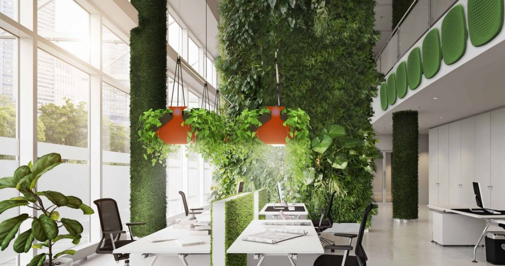
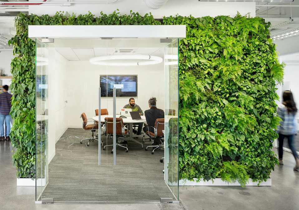
GREEN: Green is a peaceful color, often linked with the balance between the body, mind, and emotions. Green is therefore often associated with productivity and creativity, making it a popular choice for workspaces. You can introduce green by plants as well as walls or furniture. Green gives eyes some rest and helps reduce anxiety. This is especially helpful where lighting is not at an optimal level, or employees spend the day staring at computer screens
Some of the best rooms to include green include:
- Workspaces
- Lounges
- Employee relaxation areas
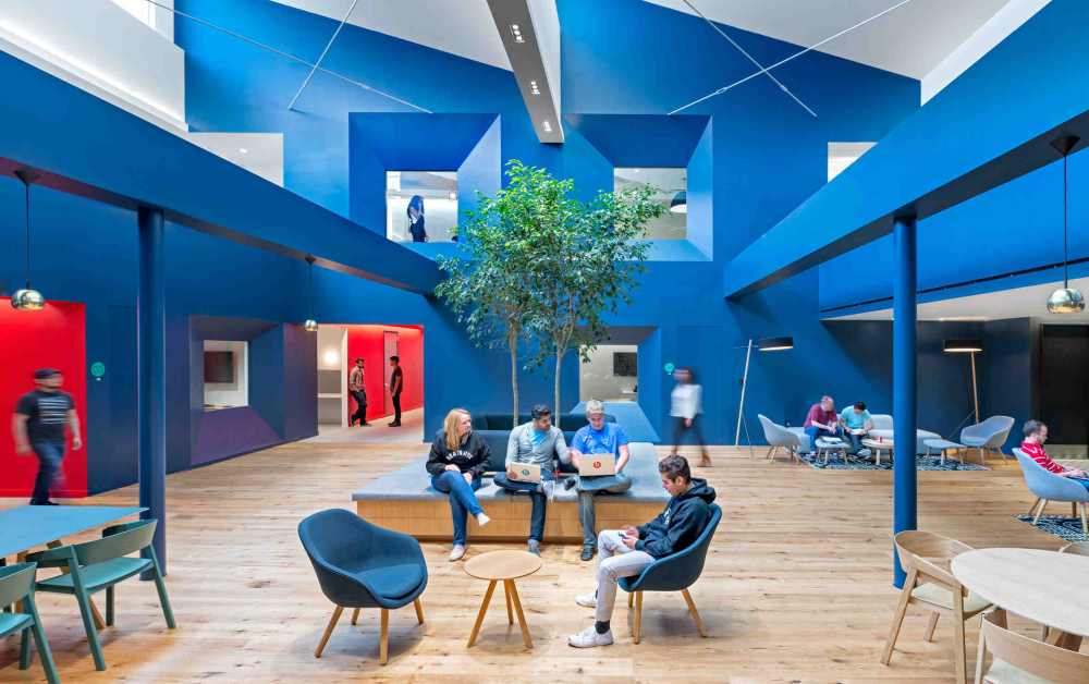
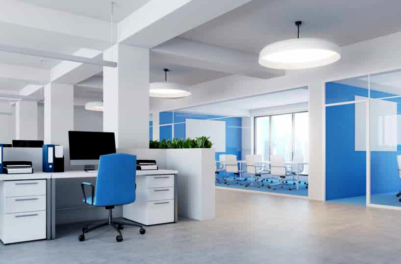
BLUE: When it comes to colors, blue is a great all-rounder. It signifies reliability and encourages intellectual thought. Research shows that blue in an office promotes a stable and calm environment, helping employees stay focused and productive. It’s a good idea to incorporate blues into areas where you want to boost productivity, such as work and collaboration areas and meeting rooms.
Blue helps reduce stress by lowering blood pressure and heart rates. Some studies state that people are more productive in blue rooms. However, the darker tones of these colors can evoke feelings of sadness.
Some examples of rooms that could benefit from a little blue include:
- Work and collaboration spaces
- Meeting rooms
- Research areas
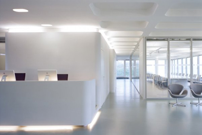
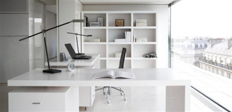
WHITE: White is usually perceived as fresh, clean, and modern. It can look appealing in wide open spaces and used with other colors to create a balance and make those spaces brighter. Uses of white could include open meeting areas, collaborative spaces, and lobbies. It is often used with other colors as on its own it can be viewed as sterile and uninspiring.
Some of the best rooms to use whites in include:
- Large recreational areas
- Open meeting areas with lots of natural light
- Collaborative spaces
- Lobbies
White on its own can be plain, but when you learn to combine it with other colors, its true potential can be unlocked, and it can add a lot of value to any design you are considering.
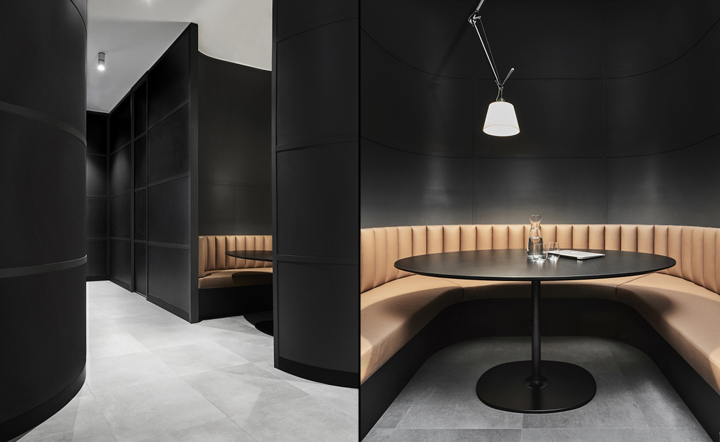
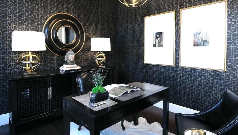
BLACK: Black is a powerful color that signifies control. It can be associated with luxury and elegance, but it can absorb natural light and should be used sparingly as an accent to complement other colors.
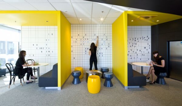
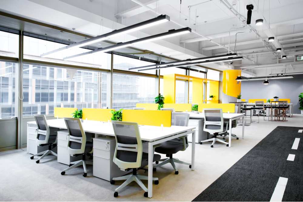
YELLOW: Yellow can invoke feelings of happiness, positivity, and optimism. Add splashes of yellow to boost creativity and stimulate teamwork. However, it’s worth noting that the over-use of yellow can also lead to eyestrain and cause frustration, so it should be used in moderation.
Yellow is a great choice in areas where your creatives work. If you want to inspire your designers, developers, artists, writers, and other creatives, splash the walls with a little bit of yellow. Yellow compliments natural light and spacious white tones well and helps build a positive atmosphere grounded in optimism. This is exactly what you want in an area where your creatives work as it will encourage them to keeping doing great things.
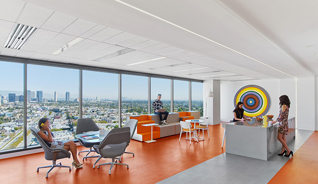
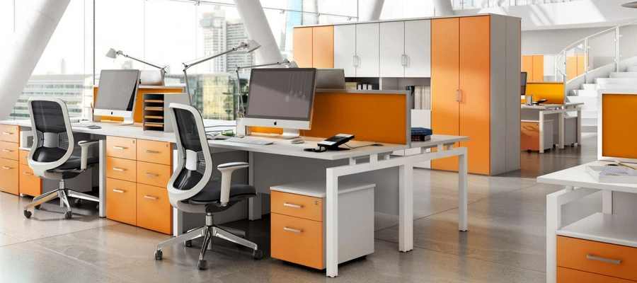
ORANGE: Orange is perceived as friendly, cheerful, and successful. It’s eye-catching and is often used to promote energy and creativity. Again, the over-use of orange is linked with frustration. However, when mixed with other colors such as white, it can be very impactful.
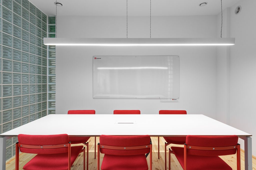
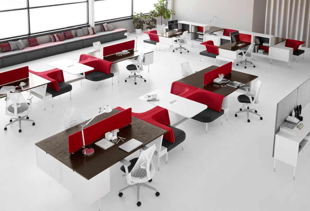
RED: Red is bold and confident. It can invoke passion, energy and stimulate thinking. It is also known to increase heart rate, blood flow and appetite. Too much red can be overpowering and lead to headaches, anger, and frustration. For this reason, it should be used sparingly in workplace design.
Some of the best areas to use red include:
- Office cafeteria
- Spaces with movement (hallways)
- Areas where people work late at night
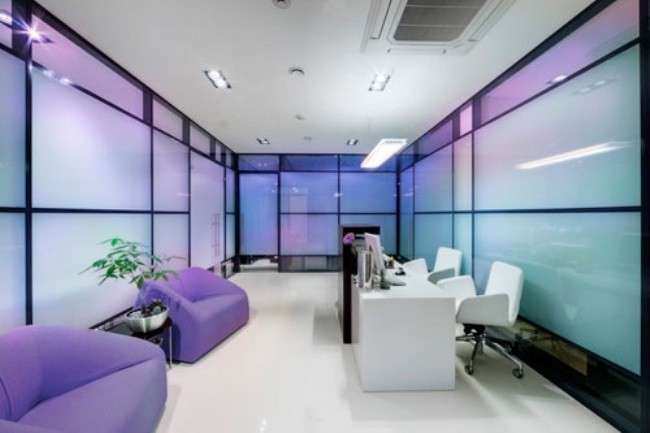
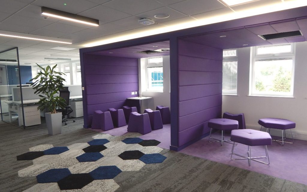
PURPLE: Purple is often associated with luxury, imagination, wisdom, and calmness. Different tones could be used to add a sense of calmness to the workplace.
Whether you want to believe it or not, this is the natural reaction from your brain due to the colors that you face in your workplace every day.
The best thing to take away from this is the fact that colors do impact the way we work. The subtle changes that adding a little color to an office can create will surprise you.
Changing your office color scheme doesn’t have to be challenging. Whether you repaint a few accent walls, update some furniture, or call a designer and help you make the right color choices, you have many choices readily available.
If you would like to learn more about color psychology and how to incorporate it into your office, feel free to contact me: [email protected]
